Cult, A Place For 'U'
Client: Cult Entertainment, AU
Services: Branding, visual identity, menus & collateral
Year: 2021
Services: Branding, visual identity, menus & collateral
Year: 2021
See more at cultsydney.com
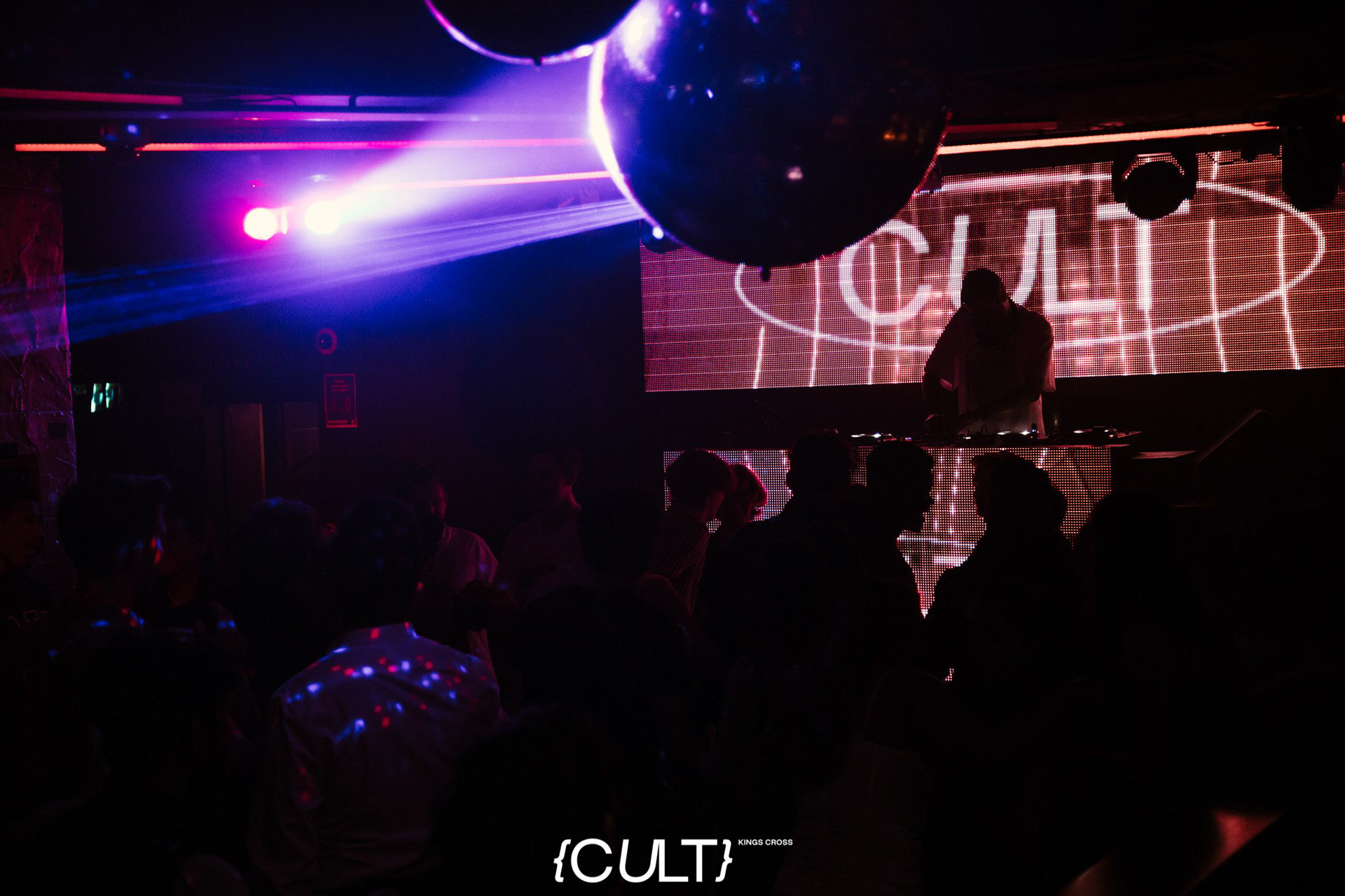
Reintroducing Sydney's Kings Cross to the live entertainment and nightlife scene would be a tough challenge for Cult following years of public decline and lockout laws. By welcoming patrons from all walks of life, the venue seeks to introduce likeminded people through a variety of events whilst ensuring every patron feels seen and looked after.
Cult looks after their own, ensuring the venue is a place just for you, no matter your personal interests, ideologies or identity.
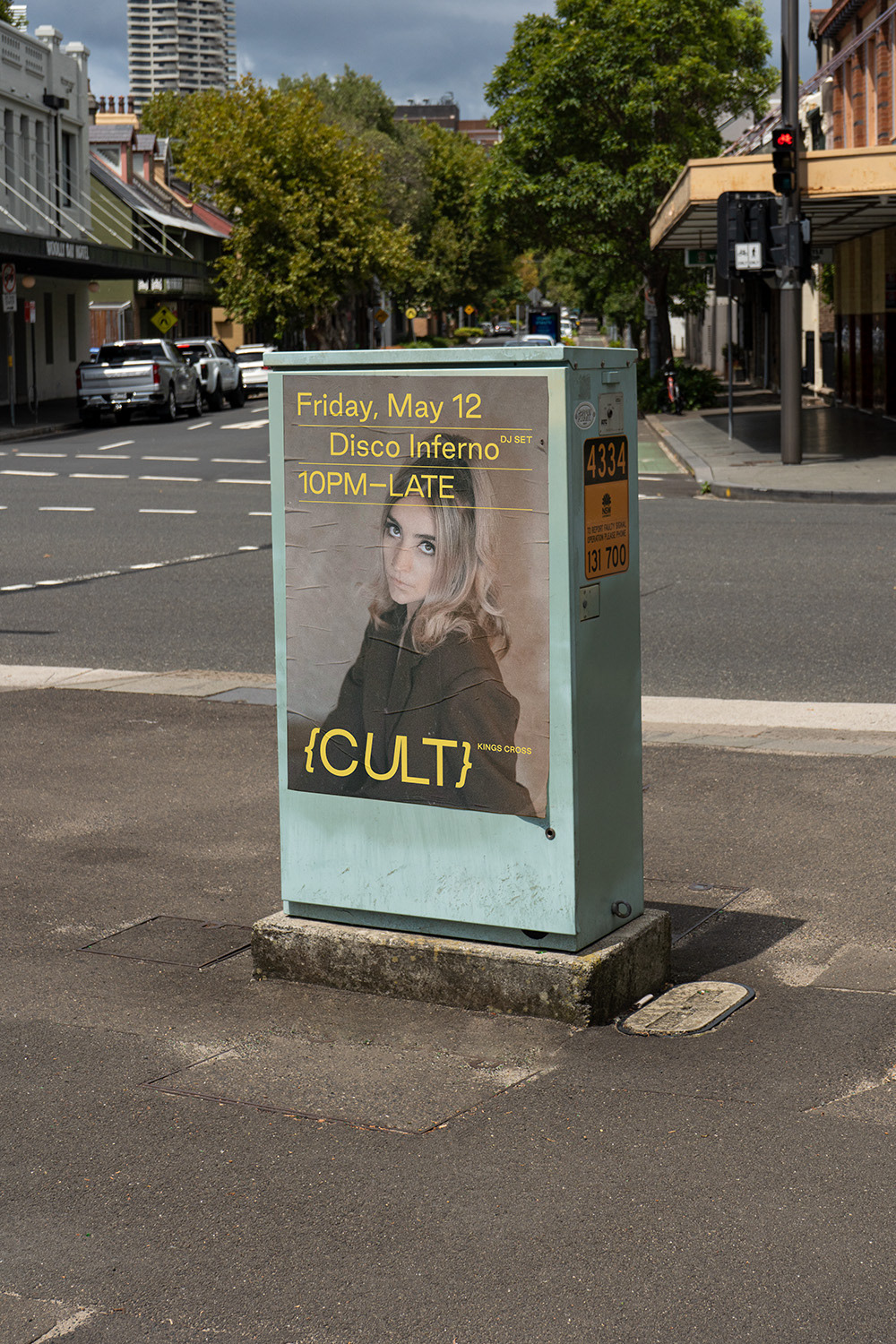
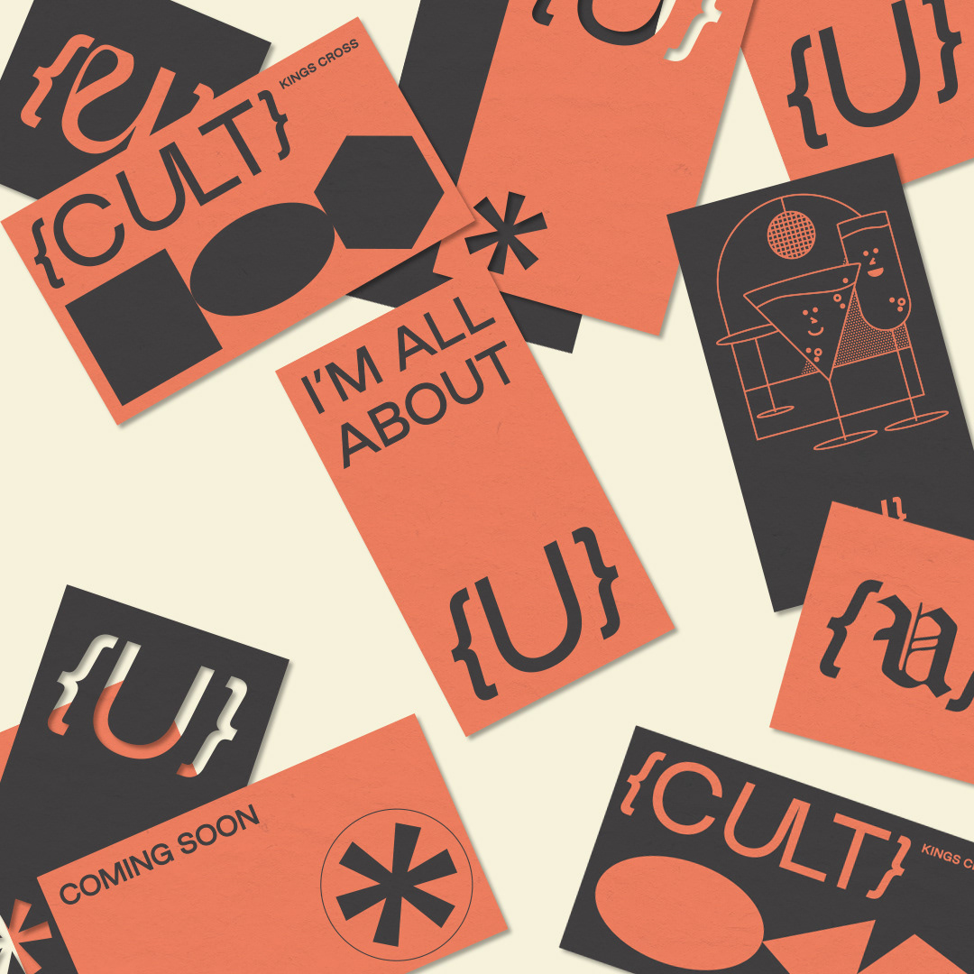
When creating the branding, it was important to avoid the obvious and literal meaning of the word 'cult' due to its more negative connotations. Instead, approaching it from the mindset of a shared passion and ideology ensured the visual identity could remain positive and inclusive. To achieve this, the typeface used for the logotype and branding (Good Type Foundry's 'Good Sans') is a friendly and approachable introduction to Cult. This, paired with the italicised elements of the logo, show it's a fun, energetic and forward thinking entertainment venue.
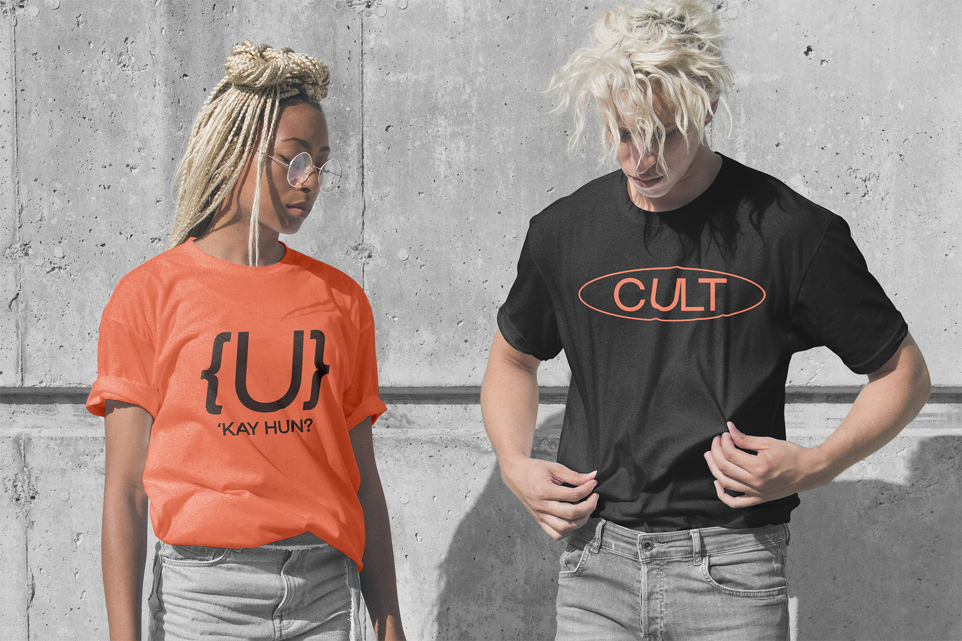
The idea of inclusivity was also a key aim for the make up of the logo — the curly brackets framing the name actually have no formal use in prose which emphasises the unique identity of the venue's patrons and reminds them that Cult is a place where they can be themselves. Likewise, the light touch between the 'U' and 'L' shows the venue is a place to connect with others and celebrate together. In order to directly portray the importance of the patrons and their individuality to Cult, the logomark only features the letter 'U'. This reflection of identity is also shown in the versatility of the mark's casual usage; swapping out different typefaces for the 'U' shows that everyone, no matter their appearance, is welcome at Cult.
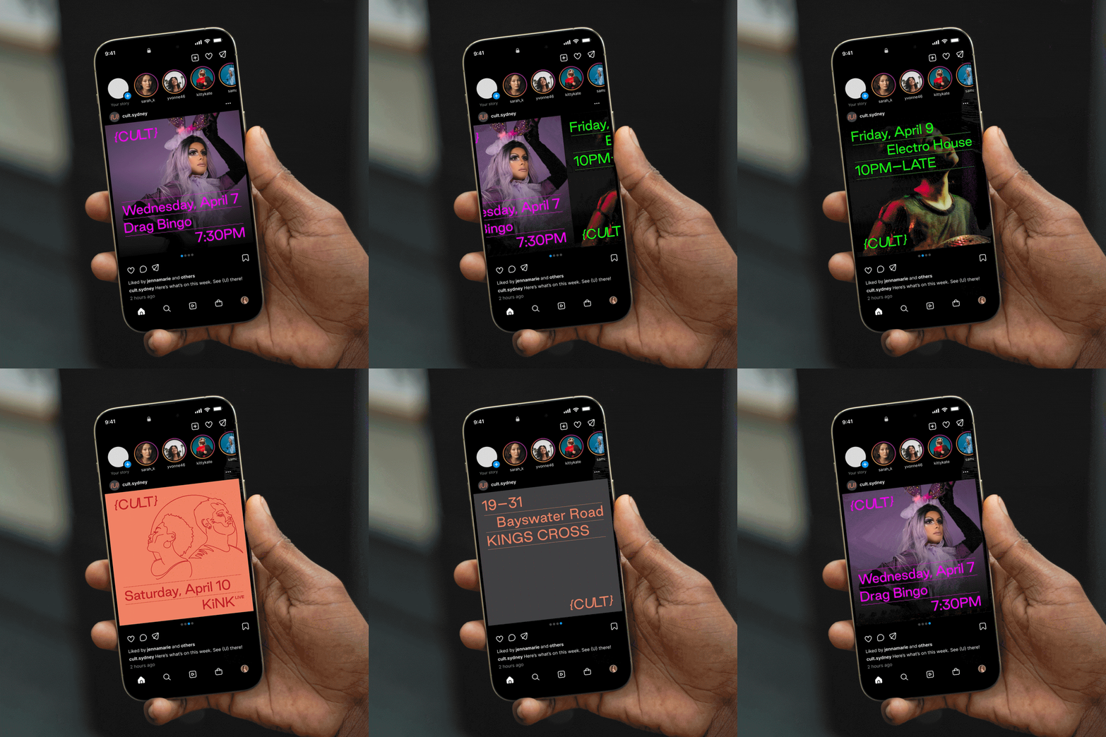
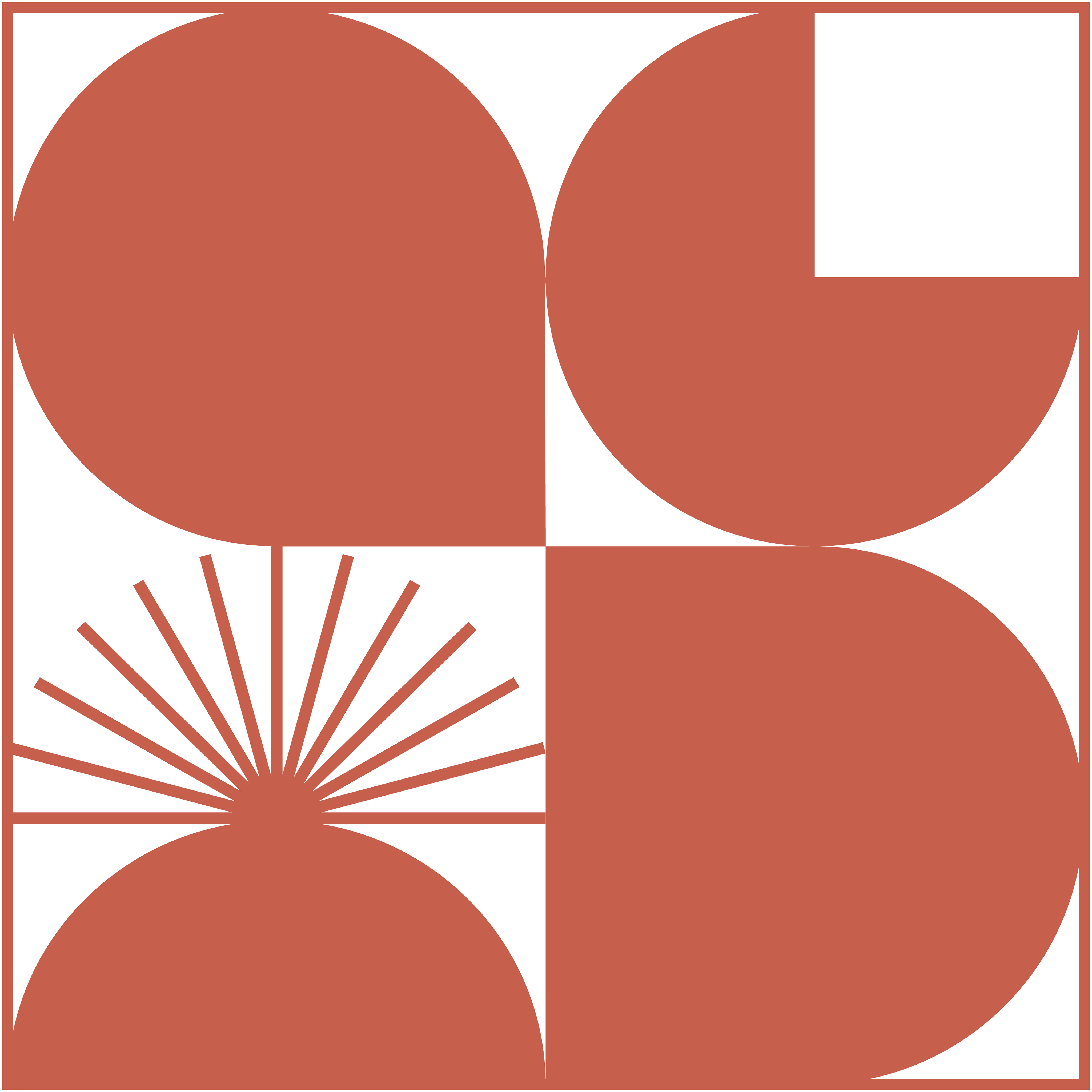
The human first nature of the venue was the primary consideration for the colour palette, which primarily utilises a Salmon Pantone due to it's warmth and connection to vitality and hope. The neon-esque effect this has when contrasted with a darker charcoal both ties in to the eclectic nightclub vibe but also portrays a sense of divergence in line with the breadth of events and community Cult hosts.

Versatile Logomark
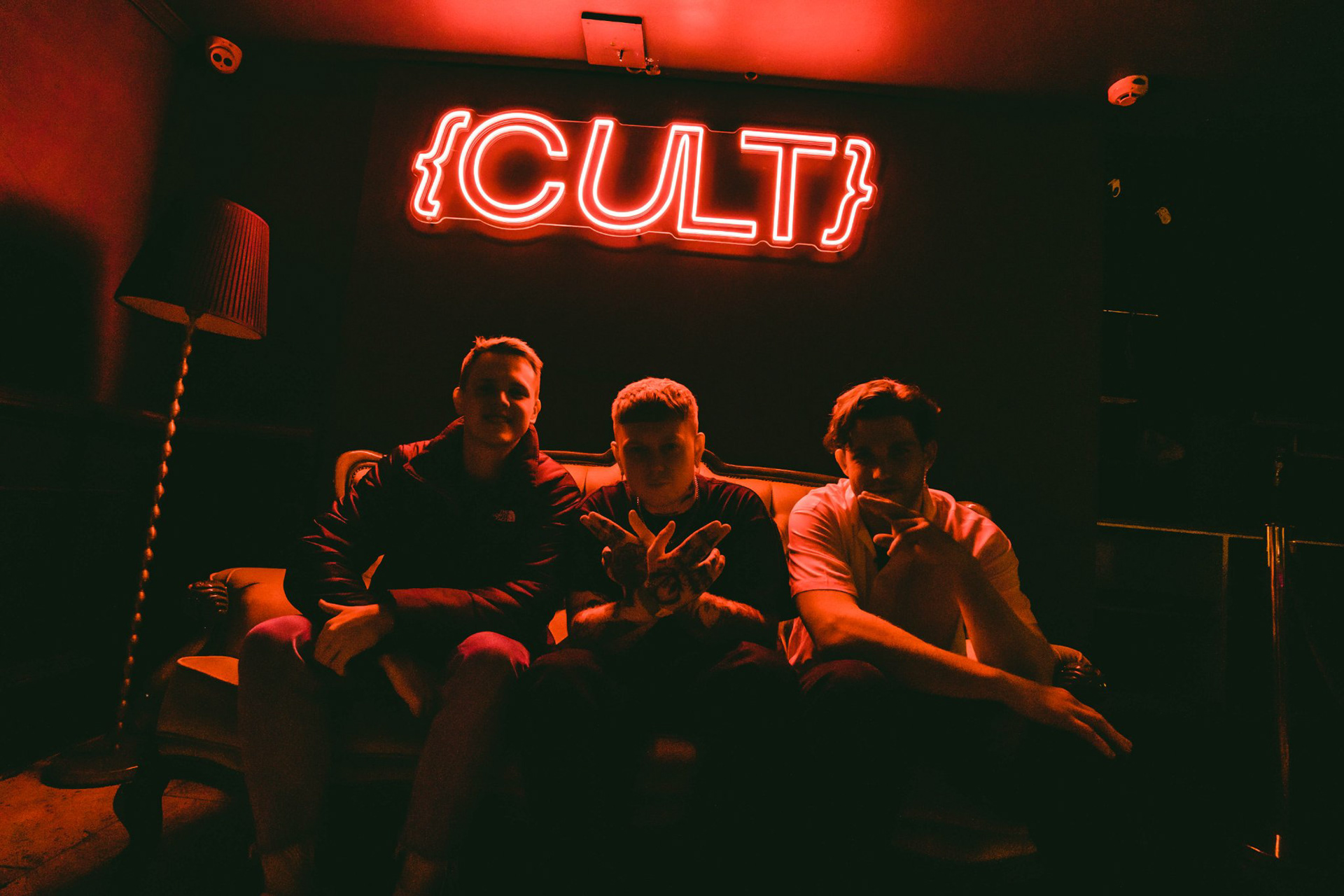
Entrance Neon
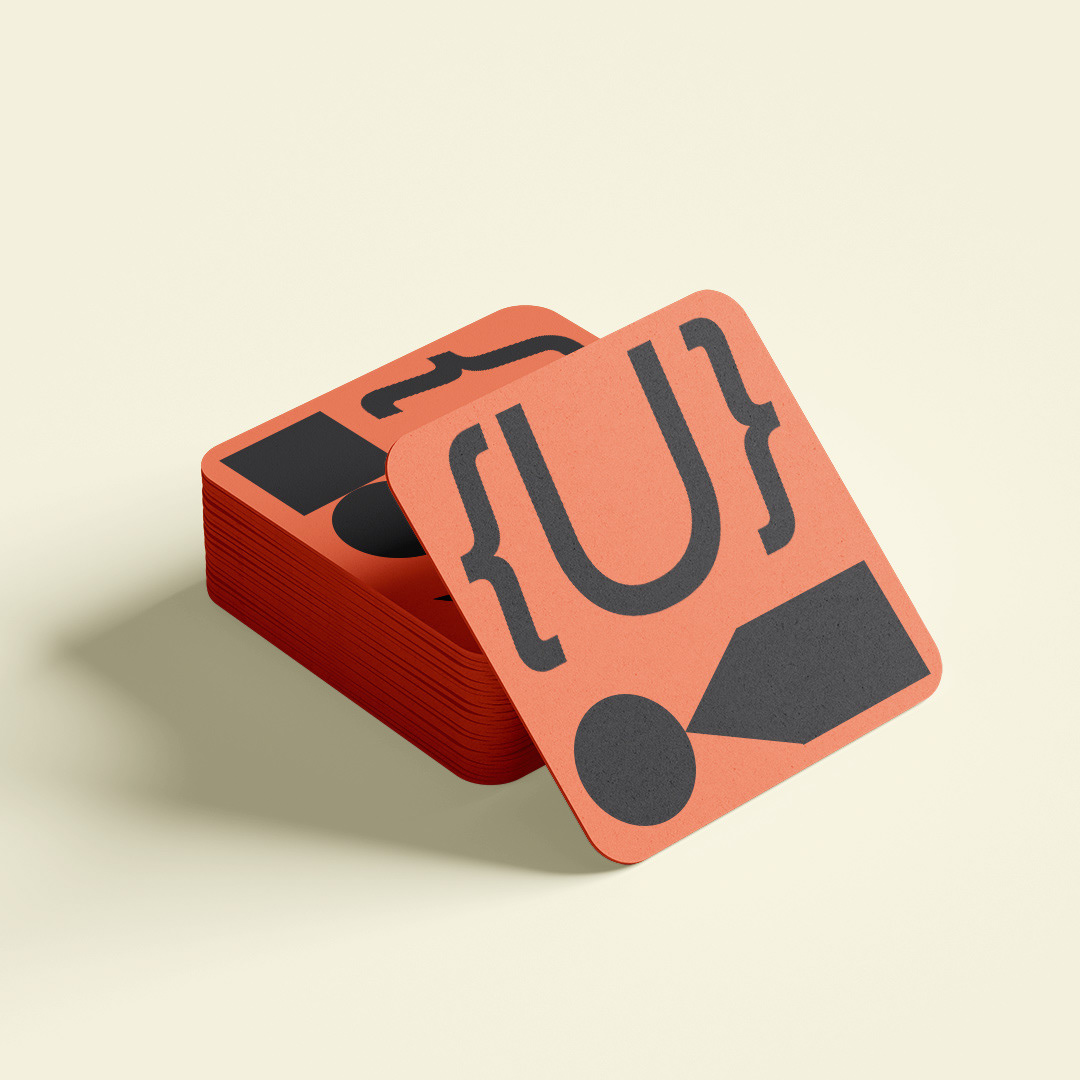
Concept Drink Coaster
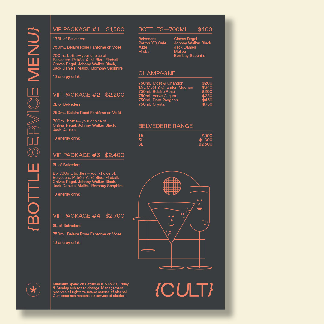
Concept Menu
