Carlotta Studios, Signage & Wayfinding Pack

Client: Hogarth, AU
Services provided: Signage & wayfinding strategy, sign location plans, sign type drawings & construction recommendations
Year: 2024–25
Services provided: Signage & wayfinding strategy, sign location plans, sign type drawings & construction recommendations
Year: 2024–25
Carlotta Studios is a large facility in North Sydney which caters to a multitude of production requirements, ranging from larger TVC and film shoots to high volume product photography with kitchen catering, set design, office spaces and an underground car park thrown in for good measure.
Labyrinthine in layout, traversing the environment proved a challenge for first time visitors and long time employees alike.
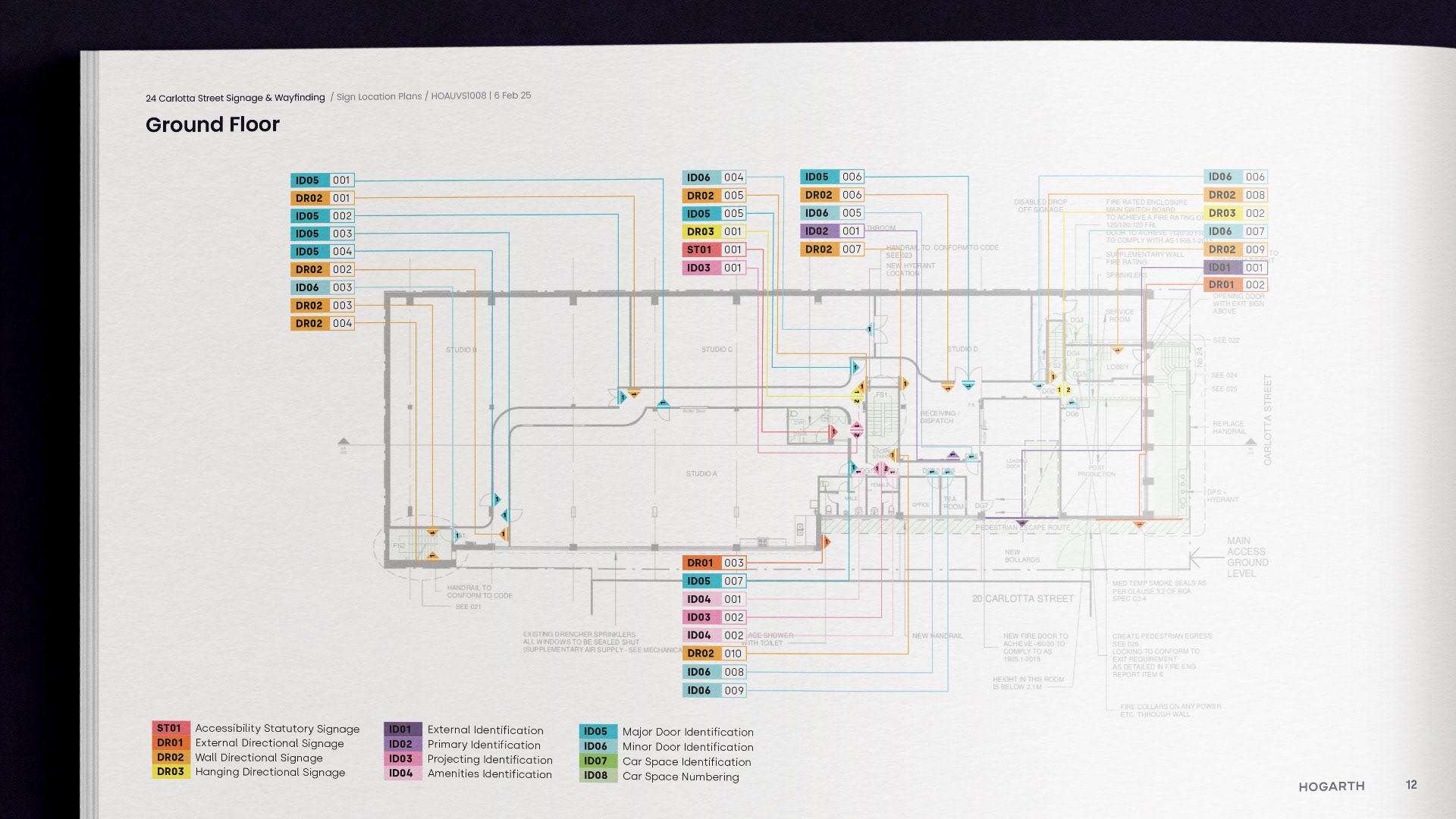
As a subsidiary of Hogarth, I was tasked with developing a signage and wayfinding system to help reduce confusion and ease navigation through Carlotta Studios. Following an extensive site visit, I noted a large number of factors to consider which would inform the later design stages. The primary white paint job throughout the building lent itself well to contrasting signage for visibility, broken sightlines with tight corridors and corners required more considered sign placement and the multi-level nature of the building meant more specific navigational prompts needed to be used to ensure the viewer could make informed decisions when moving through the environment. Following this, a sign schematic was developed to identify the types of signs that would be needed which was then paired with sign location plans for each level to determine the placement and quantity of each sign type.
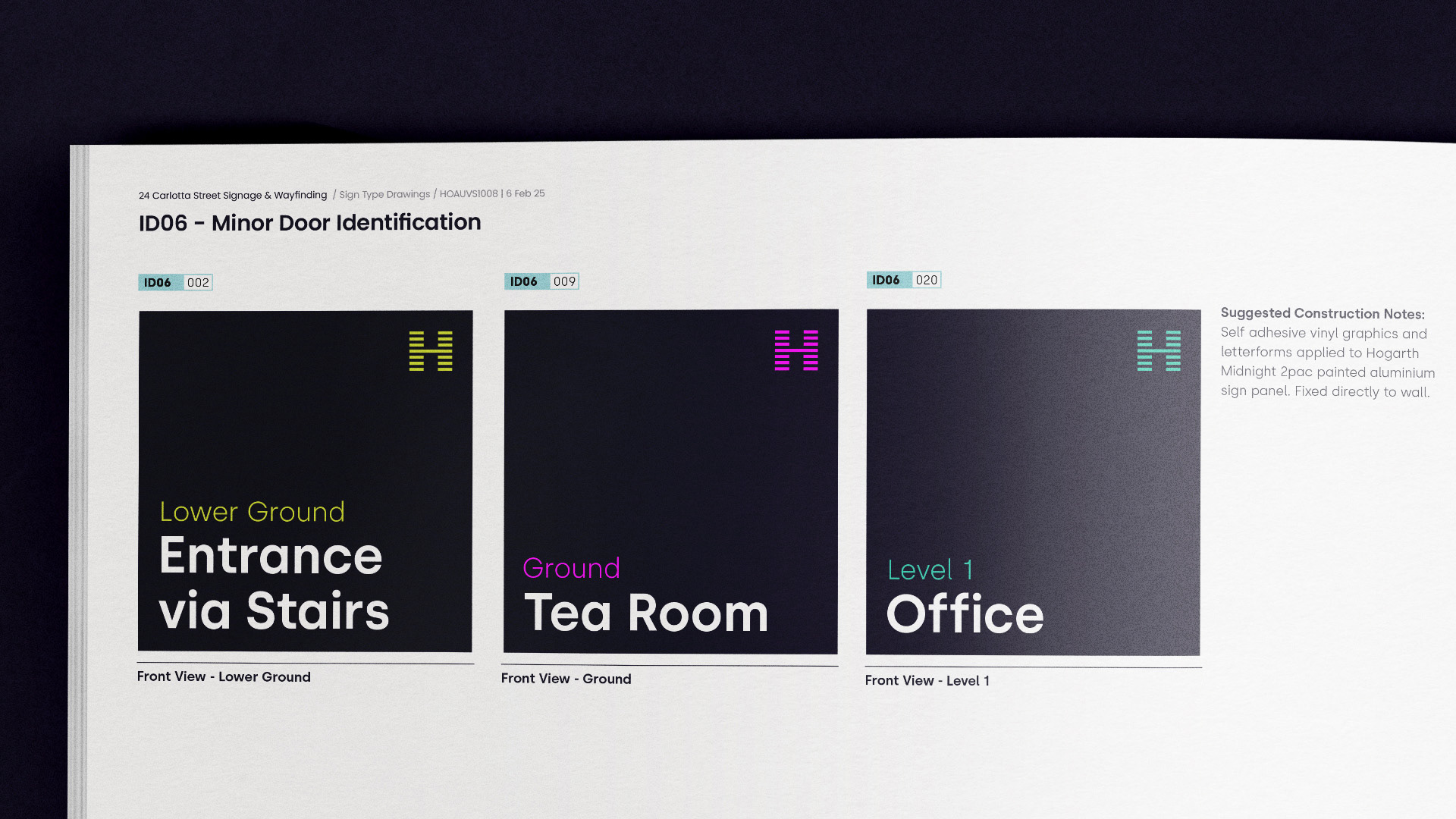
The signage design followed the function over form philosophy while maintaining the colour palette, iconography and typographic stylings featured in the Hogarth brand guidelines. Two primary concepts were developed and presented, with the recommended route leaning heavily on maximising the contrast between the signage system and the surrounding environment. This was achieved by utilising the darker 'Hogarth Midnight' colour for sign panels, major doors and painted feature walls where white vinyl or acrylic text was to be applied directly to the wall. It also encouraged the viewer to associate the 'Midnight' colour as a means of assisting their navigation through the premises. Each level of the building was also assigned a unique secondary highlight colour which helped group the signage family together and assist with spatial awareness. Early budgetary changes resulted in material and construction recommendations featuring multiple options which still maintained the look and styling of each sign for further flexibility. Other considerations included the use of LED lit outdoor identification signage for early morning and late night guidance to the car park ingress and specialised braille tactile panels for accessibility.
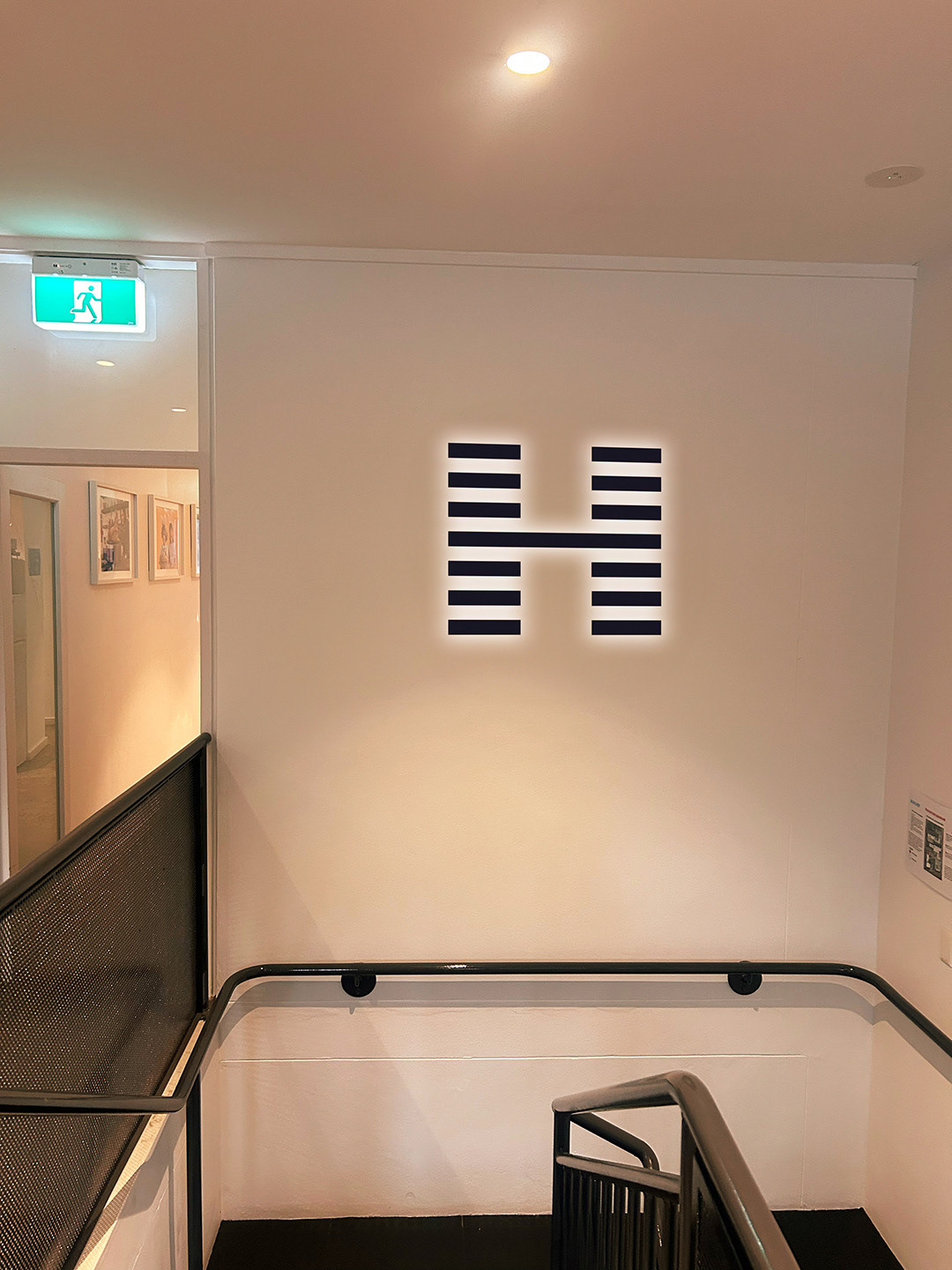
Primary Identification Mockup
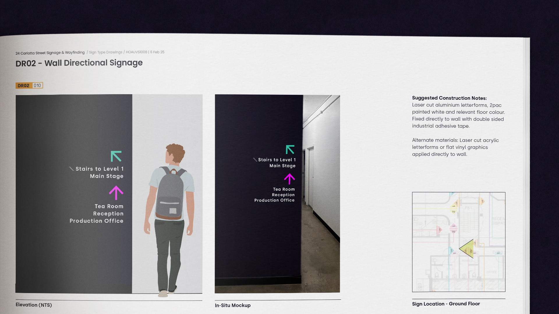
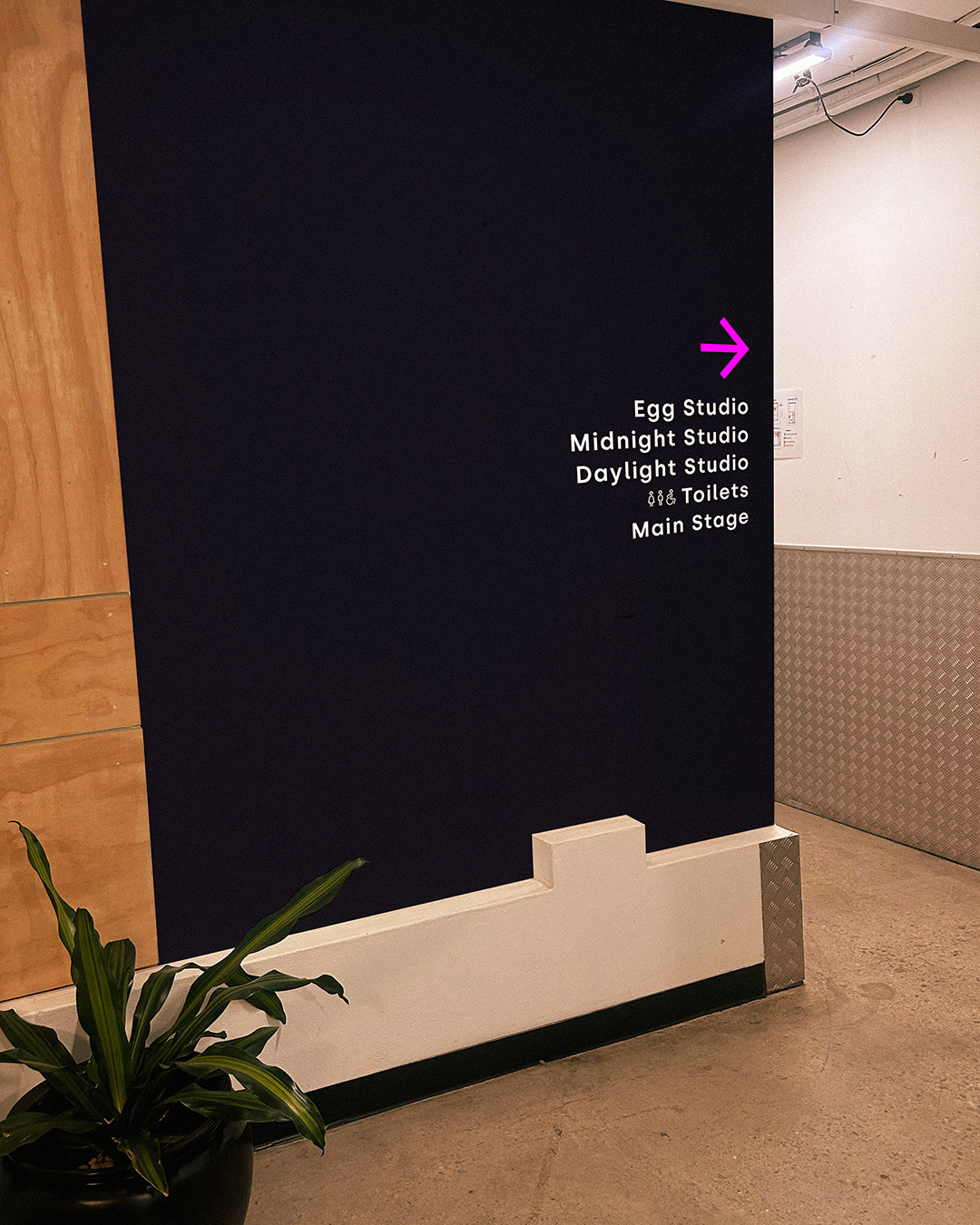
Wall Directional Mockup

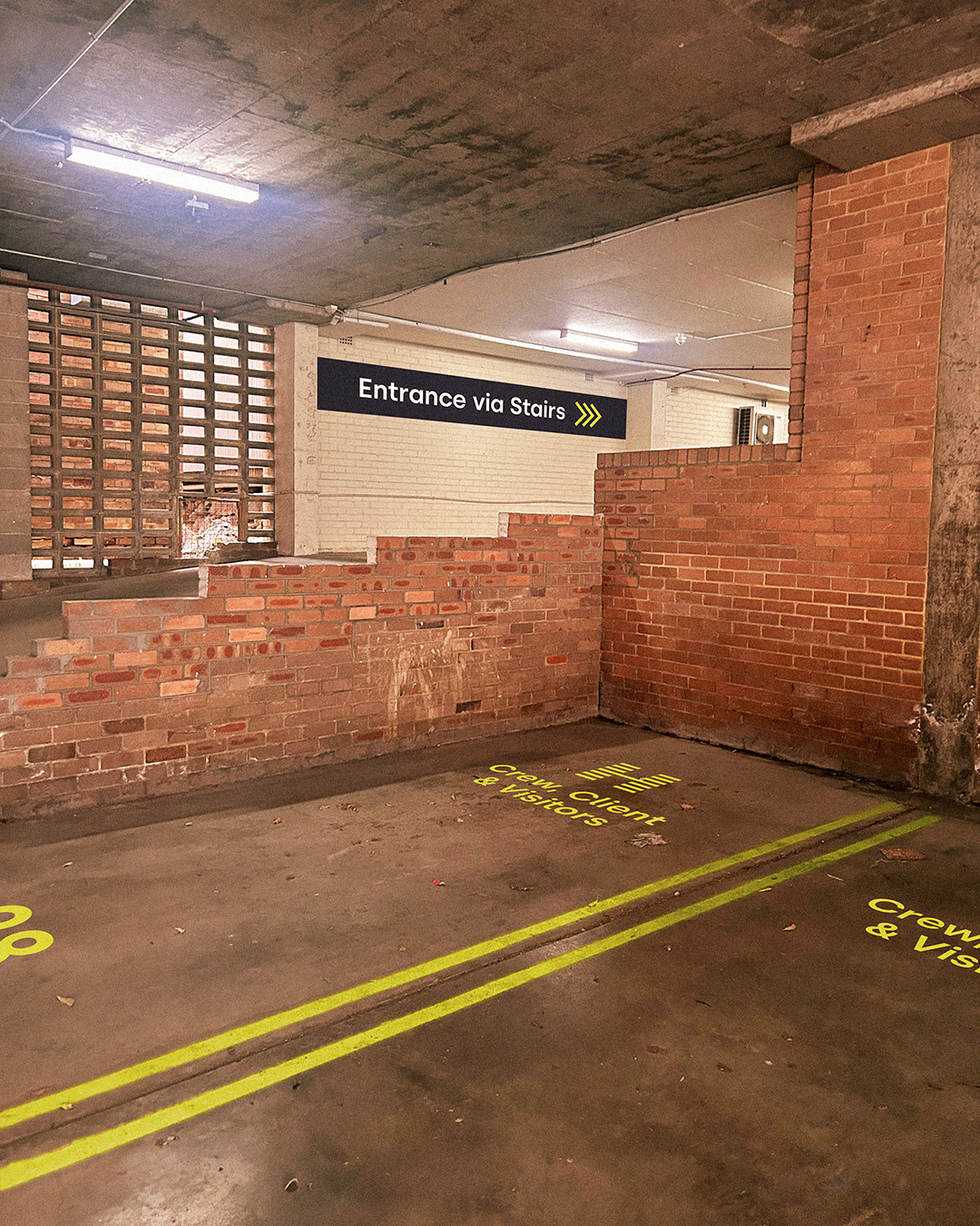
Car Park Signage